" transform="translate(7 22.824)" width="26px"/><path d="M 0 0 L 0 28.235" fill="transparent" height="28.23529443443853px" id="QytM6QdDt" stroke-dasharray="0" stroke-linecap="round" stroke-linejoin="miter" stroke-miterlimit="4" stroke-width="4" stroke="rgb(0, 0, 0)" transform="translate(20 4)" width="1px"/></svg>)

ROLE


GOAL
The challenge was to simplify and redesign key areas — Daily content, Birth Chart, and Practices — to create a calmer, more intuitive experience that still feels warm, human, and true to CHANI’s identity.
UX PROCESS
INSIGHT


Based on my analysis I had clear priorities and goals for this redesign:

EARLY PROTOTYPES
Goal: Balance Mbwenze’s storytelling with a seamless shopping journey.
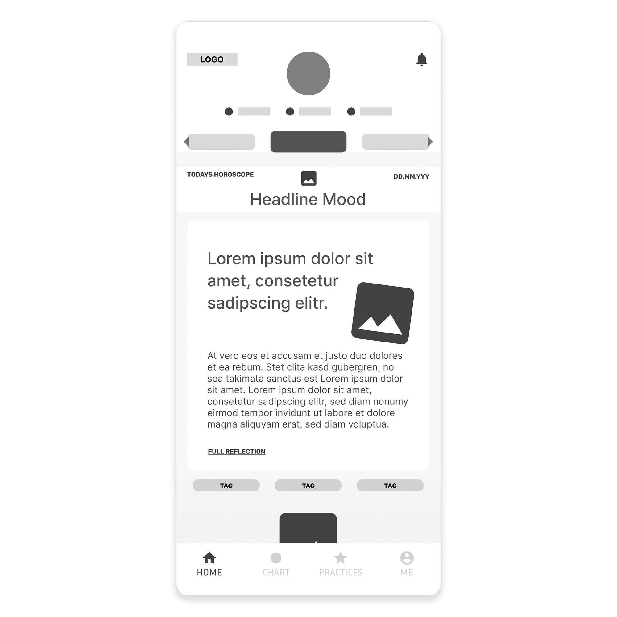
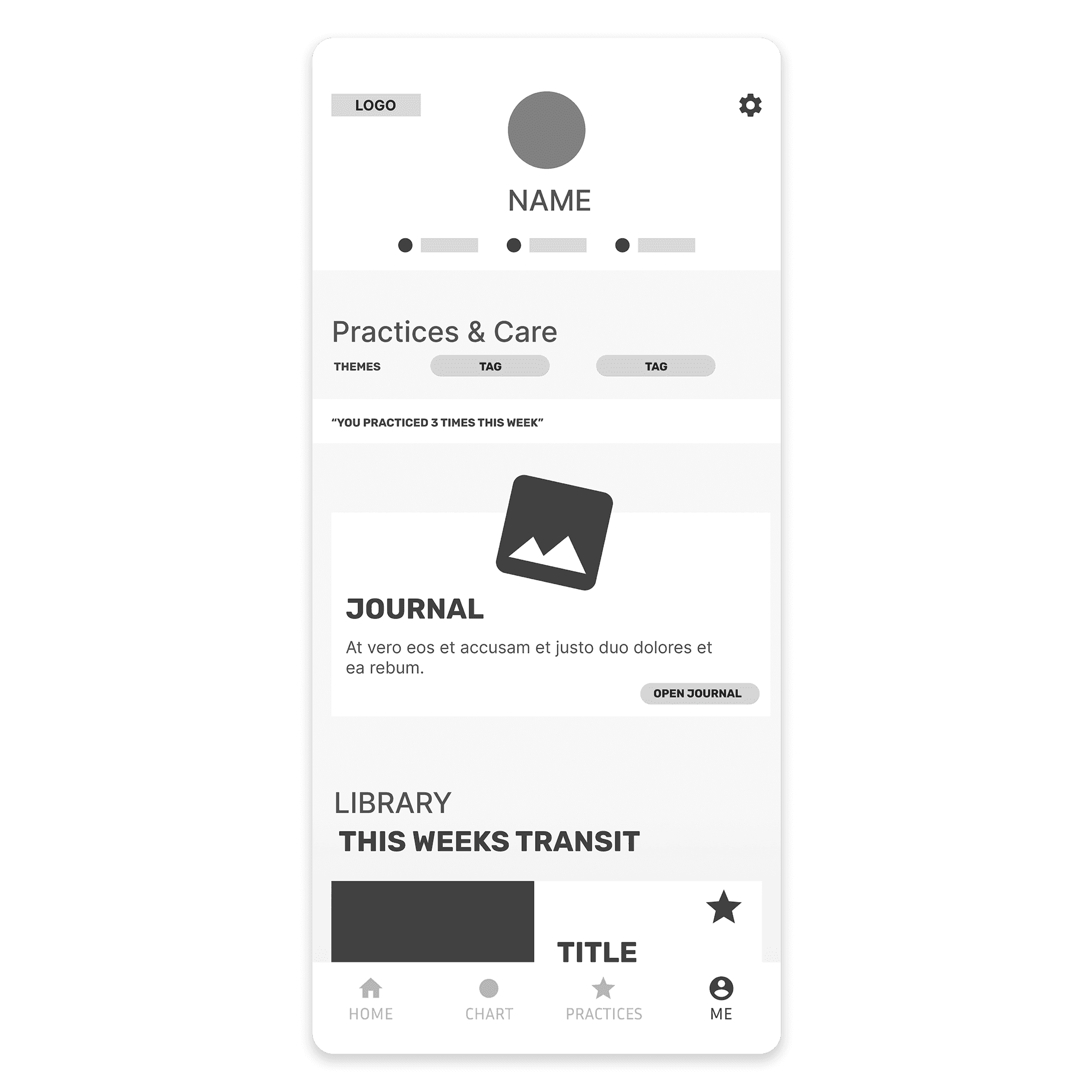


Wire frames & Flows
I mapped three key user journeys — daily guidance, birth chart exploration, and personal practices — to test hierarchy and content depth.
Focus: Find the right rhythm between quick insight and optional depth.
Key insight: Users preferred summaries upfront with deeper content revealed through “read more” and clear action cues, keeping the experience calm and guided.

Visual Design
I refined CHANI’s soft, handmade aesthetic into a lighter, more structured system.
Key updates:
Off‑white base with blush and lavender accents to mark hierarchy.
Clear typographic scale balancing legibility with expressive titles.
Collage and star motifs simplified and aligned to a consistent grid.
Result: A modern yet gentle interface that preserves CHANI’s warmth and emotional intimacy.
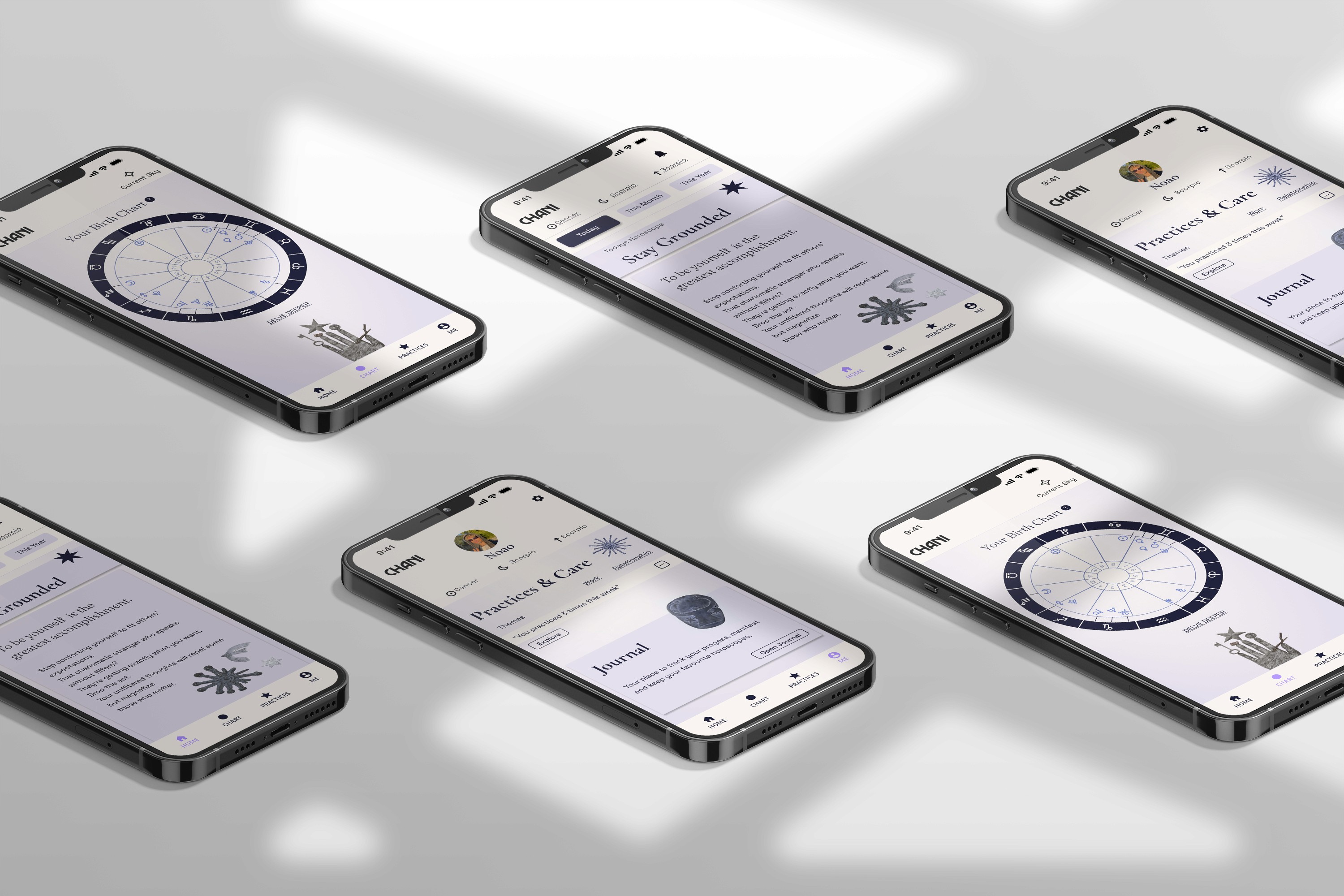
REDESIGN
1. Daily / Start Screen
Introduced short daily mood lines and quick tags for instant overview.
Modular cards made readings scannable with clear visual hierarchy.
Simplified bottom navigation to improve orientation.
Result: Users instantly understood their daily focus without losing depth.
2. Birth Chart & Placements
Transformed static chart into an interactive, thematic hub.
Grouped placements by life area and added “You today” overlay for relevance.
Result: The chart became approachable and intuitive, bridging deep astrology with everyday meaning.
3. Practices / Me Section
Unified journaling, rituals, and meditations into one “Care & Practices” hub.
Clear visual cues highlighted time, tools, and themes.
Result: Users naturally moved from insight to action with less friction.

FEEDBACK
“The redesign feels much more modern and readable — it keeps CHANI’s soul but finally lets the content breathe. Everything feels calmer, clearer, and easier to navigate.”
— Design Critique Feedback


FINAL PRODUCT